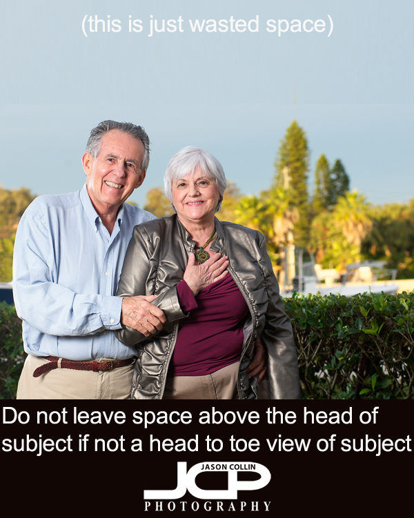
During my 1-on-1 DSLR Photography Lessons students often practice portraits, which means I often have to be the subject. I alway let the student use their instict first for composing a portrait, rather than giving them composition tips first, so I can see their natural eye for composing. A vast majority of the time this results in a portrait of me looking tiny and kind of in the photo by accident. By that I mean I am usually dead centered (an issue for a future photography tip) and very low in the frame with lots of space above my head. This results because I was composed to be dead center horizontally and vertically and most of the time was cut off at the waist. I doctored the above photo to show excess space above the heads of the subjects that is just doing nothing. It adds nothing to the photograph and in fact just makes the subject look smaller in the frame for no reason.

This is how the photograph looked as I shot it in the field, with minimal space above the heads of the subject allowing the subjects to fill the frame vertically and look like normal adult sized people and definitely in the photo on purpose.
The rule here is:
--when photographing people from the waist up do not leave space above their heads
If you photograph someone from the waist up and leave a bunch of space above their head, then it looks like you might not have intended for them to be in the shot in the first place. At the least, the person looks lost in the frame and tiny, which is not very flattering!

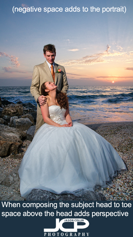
In contrast, when framing the shot to include the subject from head to toe, especially in portrait orientation, leaving space above the subject's head can add perspective to the shot. The space above the head is then not just empty useless space. Since you are showing the entire body of the subject, it puts the subject into a proper, normal looking perspective to the viewer.

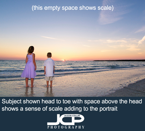
Even in landscape orientation, if you show the subject from head to toe, leaving lots of space above the subject's head will help to show the scale of the environment the subject is being photographed. In the example above, showing the wide open beach and water surrounding the children (shown head to toe) does show them properly as they are, small kids.
The next time you make portraits, be mindful of the space above the subject's head.
